The pattern of perfection

00:00
/
00:00
Pairing Parisian flair with LA colour
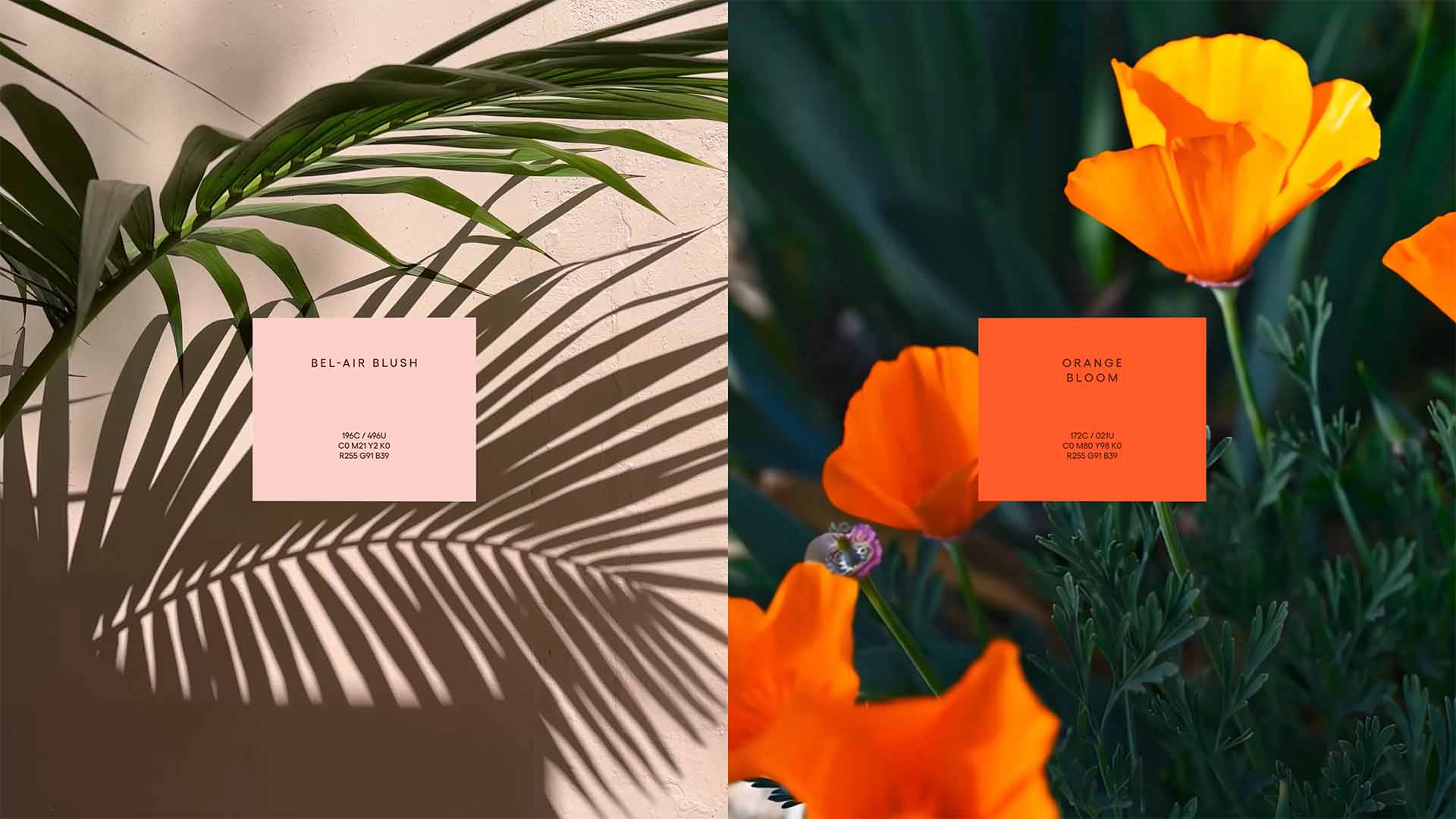
Cross the bridge into the gardens of Hotel Bel-Air, and LA recedes. In a city built on spectacle, the hotel offers sun-soaked seclusion – privacy, discretion and low-key elegance. When the hotel introduced a new Pâtisserie, the brief wasn’t to create an amenity, but to extend an invitation: a daily ritual for guests, a call to well-heeled locals, a destination that opens the gates. We created an identity that pairs Parisian flair with LA colour – old-world artistry brought into the Californian light. Modern, elegant and unmistakably Bel-Air.


The symmetry and repetition of folded pastry
The symmetry and repetition of folded pastry inspired a dynamic logotype, that expands in gestural waves across collateral. An unexpected behaviour that brings a sense of play to the sophisticated brand mark. Across wider brand expression, calligraphic illustration echoes the improbable geometry of hand piping. Tracing the movement of the chef’s hand.